Today’s B2B buyers tune out the moment a page feels untrustworthy. Yet, weighing up options is still a key step in every buying cycle.
In this post, you’ll learn six key steps to create honest comparison pages that help best-fit customers choose your product or service.
The problem with traditional comparison pages
Most ineffective comparison pages focus too much on themselves or on discrediting competitors.
That mindset produces the same weak patterns:
- Long feature lists with no context
- Cheap shots at competitors (e.g. “X is too slow”)
- Claims with no proof (e.g. “The #1 alternative to…”)
- Tables engineered to make you look good and nothing else
None of this helps potential buyers.
People visit comparison pages to understand the real differences between options and make informed decisions.
Talking only about yourself doesn’t solve that. Tearing down competitors makes you look defensive and untrustworthy.
By being honest and objective, you’ll position your product as the best fit for the right audience while acknowledging where competitors might be a better fit for unqualified buyers.
Here are six steps to help you strike that balance.
1. Highlight unique value before any features
Lead with your product or service’s unique value. The model, process, or capabilities that make you worth choosing in the first place.
Instead of lining up every feature side by side, put your strengths right at the top to anchor your comparison in what actually matters to buyers.
For example, ActiveCampaign’s edge lies in powerful automation, which enhances every customer journey touchpoint:
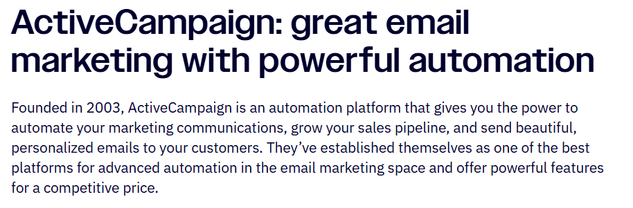
It’s a clear advantage over competitors like Mailchimp. So, the comparison page starts there.
The tone is factual, not boastful, and reads like something a neutral reviewer could write.
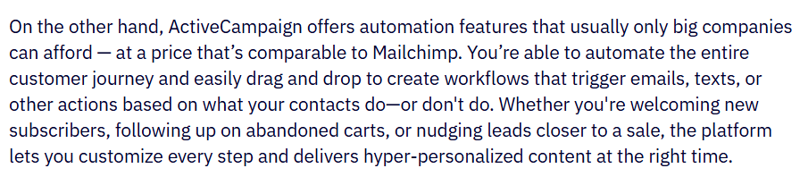
ActiveCampaign’s positioning does the heavy lifting while recommending Mailchimp as a simpler tool for beginners:
“Because the builder is so straightforward to use, Mailchimp is a good option if you're just starting or aren’t trying to automate very much.”
The brand then positions itself as the better choice for advanced automation:
When you’re clear on what sets you apart, you don’t need hype or competitor bashing.
You just explain the value that only you provide.
Before writing any comparison page, define your specific differentiators against that competitor.
Then, build the entire narrative around those.
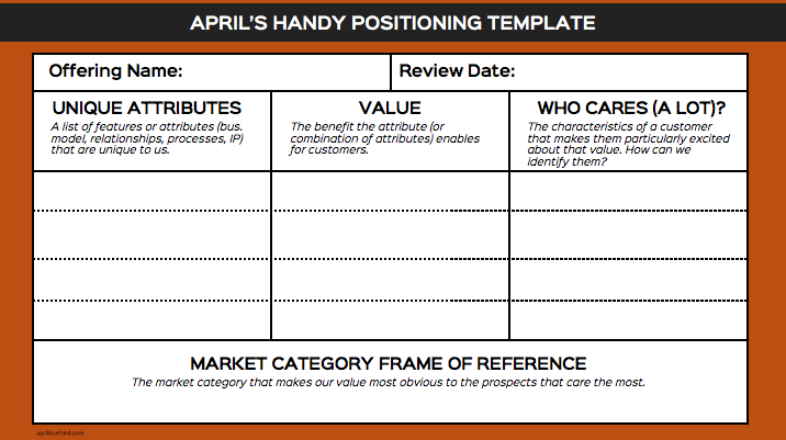
April Dunford’s product positioning exercise is a solid framework for this:
- Understand where you stand today and your core value
- List your unique attributes
- Link each attribute to a real customer pain point you solve
- Identify who cares most about those strengths (i.e. your ideal buyers)
- Pick a market frame that makes your value obvious to those buyers
When you anchor comparison pages to your differentiators, you give buyers clear, useful context while staying honest.
2. Create trust with your comparison tables
Strong comparison tables help potential customers make informed decisions by attracting best-fit buyers and filtering out those who aren’t a match.
While these visuals are one of the fastest ways to show how you stack up, they’re also easy to misuse.
For example, we’ve all seen tables like Asana vs. Monday:
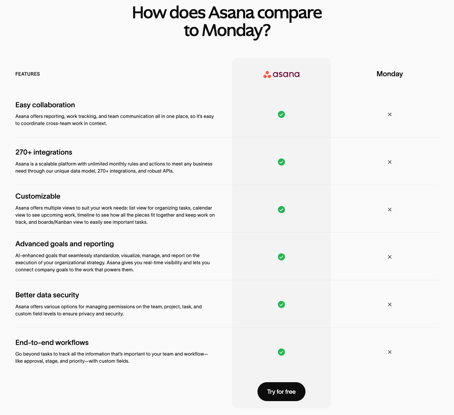
Buyers don’t trust one product coming out on top in every category, and can tell when you’ve cherry-picked features.
Instead, focus on 6–8 core features that are directly tied to buyer needs and pain points. (Not just those you excel at.)
This keeps your brand honest and even improves usability.
NN Group eye-tracking studies suggest that people tend to read comparison tables in a lawnmower pattern.
If your table is too long or cluttered, readers struggle to keep track of information.
There will likely be products that share similar capabilities. So, the real value comes from how you frame differences.
Show strengths clearly, without pretending the competitor offers nothing.
App-building platform Nocoly simply presents facts when comparing itself to Outsystems:
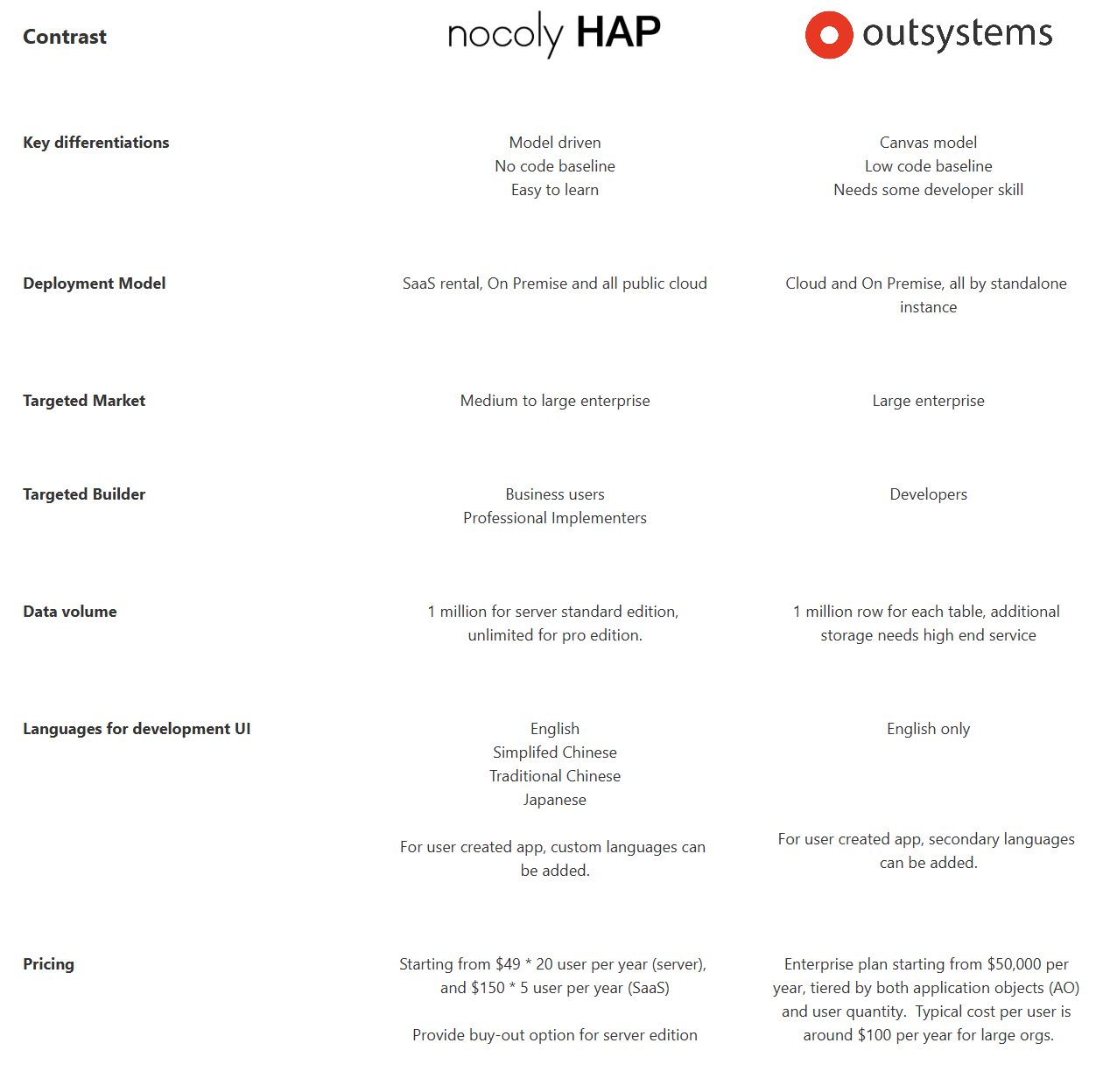
The neutral tone makes the comparison feel more believable, while the differentiation on data, languages, and pricing stands out naturally (without attacking the competitor).
Don’t aim to “win” every buyer with your comparison tables. Instead, use them to clarify who you serve best.
3. Give competitors credit to strengthen your own positioning
Acknowledging where competitors shine makes your comparison page feel trustworthy and differentiators more believable.
Some competitors will outperform you in certain areas.
You know it. Buyers know it.
Being upfront about that sets your page apart from the majority and builds instant credibility.
For example, Claap recognizes Gong’s leadership in “Revenue Intelligence” instead of downplaying it:
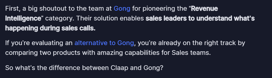
Then, Claap explains why it’s a strong alternative to its respected competitor.
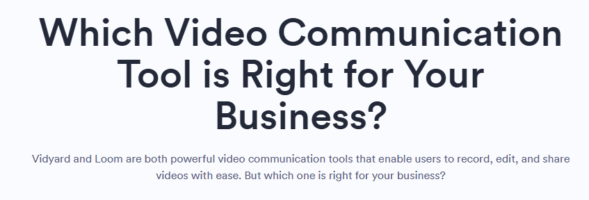
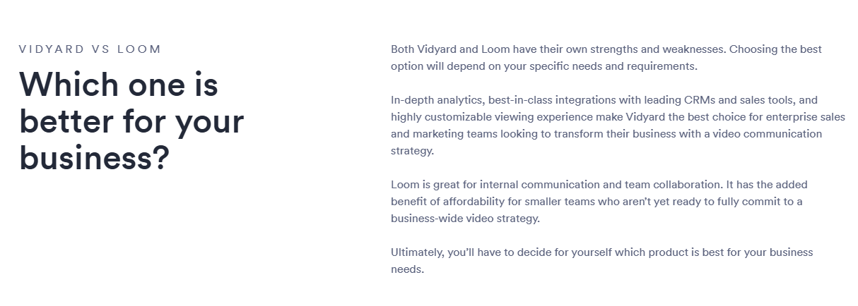
Vidyard uses a similar tactic, first acknowledging Loom as a powerful tool:
ActiveCampaign even takes this a step further, praising Mailchimp’s superior ease of use:
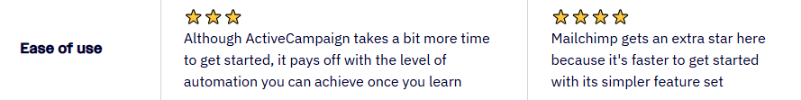
This kind of honesty stands out because it’s factual and confident.
It’s also the opposite of the “talk ourselves up while trashing everyone else” approach that most companies use (and buyers ignore).
It all ties back to positioning.
When you’re clear on your own strengths, giving competitors credit reinforces your authority.
Here are some tips on how to credit competitors effectively:
- Identify where others excel (e.g. features, usability, or reputation your audience respects)
- Acknowledge it clearly but briefly (one line is usually enough)
- Avoid an exaggerated tone or backhanded compliments, which can feel insincere and undermine trust
- Use visuals when possible—screenshots or data points make recognition feel factual, not promotional
This approach signals confidence. You communicate: “we know what others do well, and we still believe we’re the best fit for you.”
4. Address the real alternatives buyers are using
Buyers aren’t just comparing you to competitors. They’re also comparing you to existing processes and spreadsheets.
Highlighting and outpacing these solutions wins trust and conversions.
SaaS brands often define competitors too narrowly: “Who else makes software like ours?”
In reality, your competition includes everything buyers are currently using to solve the problem.
April Dunford calls these “status quo” solutions—the free, simple, or familiar tools people rely on before they even see your product.
For instance, many businesses manage projects in spreadsheets or via email.
Therefore, comparison content for project management platforms should address these solutions—especially in middle-of-funnel (MOFU) “alternatives” articles.
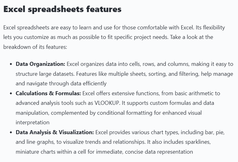
Take ClickUp, which acknowledges Excel’s value when comparing its platform to spreadsheets:
Then it subtly positions ClickUp as the more effective solution in a table:
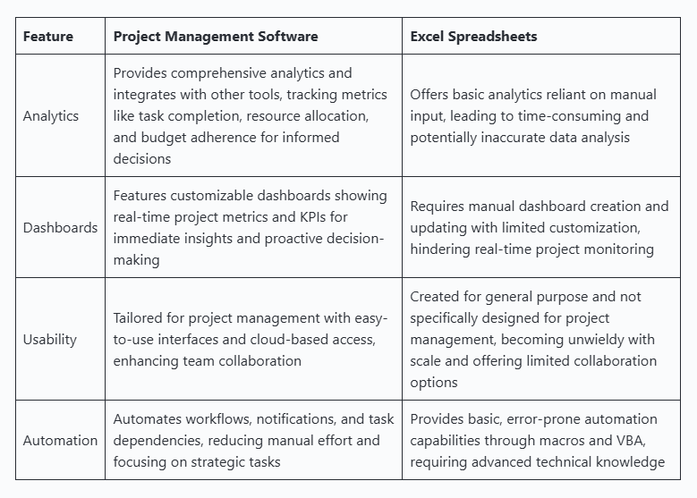
By addressing the status quo, ClickUp earns trust before prospects even start comparing other project management tools.
Here are three ways to identify these alternative solutions:
- Ask, “How are our target customers solving this problem today?” and list the answers
- Review market research, customer interviews and sales conversations for recurring patterns
- Pinpoint the alternatives that actually influence buyer decisions to talk about
Dunford warns against “phantom competitors”—solutions your prospects don’t know or care about.
Trying to position against them dilutes your messaging and weakens your differentiation.
Focus on the alternatives that matter, show how you improve on them, and your comparison content will resonate with buyers where it counts.
5. Help buyers select the right solution for their specific needs
Comparison pages should help prospects make informed decisions about the right product for them. Don’t just pitch your product to everyone.
Your goal is to attract the right prospects and make them feel confident in their choice with genuinely helpful information.
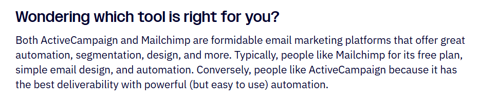
Let’s circle back to ActiveCampaign’s Mailchimp comparison page.
It positions Mailchimp as a cheaper, simpler alternative.
Then highlights its own tool as having the “best deliverability” and “powerful (but easy to use) automation”:
Vidyard takes a similar approach vs. Loom.
Instead of answering “Which is better?” with biased sales copy, it presents an objective view and lets readers decide for themselves:
Grizzle helped XTM create an opening table to show that its website localization tool is for large enterprises.
Then, it highlights other solutions that are more suitable for small teams or solo business owners:
XTM’s ideal customer is naturally drawn to its product, while everyone else is pointed in a different direction.
Describe who your product is for (not just how it beats competitors) in comparison pages, so readers can see which solution fits their needs best.
Present features and differences clearly and transparently. Trust your positioning.
That’s how you create neutral, informative comparisons that still demonstrate superiority.
6. Use targeted customer stories to validate your claims
Letting customers tell their own stories adds credibility and proves your product wins in the real world.
Generic reviews don’t move buyers at the comparison stage.
Hearing from people who switched from the same competitor to you does.
For example, FreshBooks nails this on its QuickBooks comparison page:
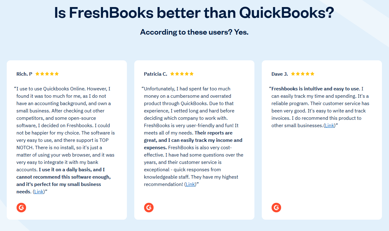
A testimonial from someone who moved from QuickBooks carries far more weight than a five-star rating with no context about why they switched.
It details the customer’s pain, the change, and the outcome achieved.
To capture this type of social proof, build it into your workflow:
- Note which product customers switched from during sales or onboarding
- Follow up a few weeks later and ask for a short interview
- Question what wasn’t working before, why they switched, and what changed after adopting your tool
- Pull the clearest quotes that map directly to the comparison you’re making
You can also borrow FreshBooks’ approach and pull switcher reviews from third-party sites like G2 or Capterra.
Brands like Nocoly take this further, inviting customers to contribute directly to comparison pages.
Founder Phil Ren explains this transparent, user-led approach:
“We regularly update this section with real, selective insights from customers. While the content is curated, it reflects genuine customer experiences and offers valuable context for potential buyers facing similar decisions.”
The more real customer experiences you highlight (especially from switchers), the more objective and persuasive your comparison pages become.
A comparison page is an extension of your positioning
When you anchor comparison pages in your unique strengths, you give best-fit buyers clear, compelling reasons to choose you.
Help potential customers evaluate fairly. Show what competitors do better. Support your claims with real-world testimonials.
Do this consistently, and comparisons will feel less like sales pitches and more like trust-builders.
Need help creating comparison pages that strengthen your credibility and drive conversions? Book a demo today and let’s chat.